When your kitchen feels open, fresh, and welcoming, the right paint color plays a huge role. A bright and airy kitchen depends on shade, finish and light working together. Getting the paint color right means choosing tones that bounce light, expand the visual space, and match your kitchen’s light and style.
What Makes a Kitchen Look Bright and Airy
The science of light reflection and LRV
Every paint color has a Light Reflectance Value (LRV), which measures how much visible light a surface reflects. Higher LRV means more light reflected, making a space feel brighter and more open. For example, a color with LRV above 70 will reflect a lot of light and help produce the airy feeling; lower LRVs absorb more light and can make a space feel smaller.
How wall color interacts with natural vs artificial lighting
A color may look one way in daylight and completely different under warm kitchen lighting. Natural light direction, window size, and artificial lighting all change how your paint behaves. In a kitchen with lots of natural light, even a mid-LRV paint can look bright; in a dim kitchen you’ll want a higher LRV color.
The role of undertones — warm vs cool — in achieving a fresh feel
Undertones (soft hints of blue, green, pink, yellow) affect how “clean” or “stuffy” a kitchen feels. A cool undertone might make a space feel crisp; a warm undertone makes it inviting. Picking a neutral or light color without battling the undertones of your cabinetry, flooring or countertops helps maintain that airy impression.
Why finish (matte, satin, eggshell) matters for brightness
Paint finish alters how light is reflected:
Matte finishes absorb more light and can dull a space
Satin or eggshell reflect more light and help bounce brightness around Choosing a finish with moderate sheen helps maintain brightness without excessive glare.
Factors to Consider Before Choosing a Paint Color
Natural Light Direction – north, south, east, west-facing kitchens
East-facing: morning sun, good for warmer cool tones
West-facing: afternoon sun, may warm up colors more
North-facing: less direct sunlight, benefits from higher LRV colors and warmer undertones
South-facing: strong natural light, you might manage with slightly lower LRV and cooler undertones
Cabinet & Countertop Colors – coordinating tones for harmony
Match your wall color so it complements cabinet finish rather than competes. If cabinets are dark wood, a light neutral wall helps keep balance. If counters are white quartz, you might select a warmer wall tone so everything doesn’t feel too cold.
Flooring & Backsplash – avoiding clashing or dull pairings
Your flooring and backsplash will reflect into your perception of wall color. If flooring is very dark, a lighter wall is essential to keep brightness; if backsplash is lively or colorful, wall color should be more subtle.
Kitchen Size & Ceiling Height – how to visually expand smaller spaces
Smaller kitchens benefit from high-LRV pale colors that reflect light and visually push the walls outward. Higher ceilings can handle slightly deeper tones, but keeping the walls and ceiling similar or the same color helps maintain continuity and airiness.
Overall Style – modern, farmhouse, coastal, minimalist, etc.
Your paint choice should support the kitchen style. Modern might call for pale greys or greige; farmhouse may lean toward warm creams; coastal can incorporate soft blues or greens. Choose a color that supports style + brightness.
Best Light Neutrals for a Bright, Airy Look
These are the go-to palettes for creating that open, fresh kitchen feel:
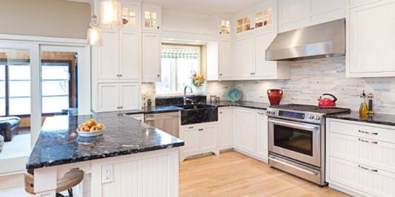
Soft Whites (timeless, high reflectivity)
Examples: A white such as “White Dove” or “Alabaster” has very high LRV, excellent for reflecting light.
Undertone: Choose one that doesn’t clash with your cabinet finish (some whites lean slightly pink/grey).
Ideal for: kitchens where walls, ceiling and trim are all painted the same or very close.
Warm Creams – cozy without being yellow
Slightly lower LRV than pure white, but still very bright and airy.
Undertone: gentle yellow/ivory warmth.
Ideal for: traditional, cottage or farmhouse style kitchens.
Pale Greys & Greige – subtle contrast, modern appeal
These give a soft contrast to white cabinetry or bright counters while maintaining openness.
Undertone: pick greige (grey + beige) or greys with minimal blue undertone.
Ideal for: modern kitchens wanting airy feels but not stark white.
Light Beige & Taupe – earthy warmth that doesn’t dull
Slightly deeper than cream but still light enough to reflect ample light.
Undertone: soft brown/beige.
Ideal for: kitchens with warm wood flooring or warm metal hardware. In all the above neutrals, referencing the LRV numbers helps: picking a paint with LRV above 60-70 ensures brightness in most well-lit kitchens.
Best Pastel and Colorful Shades That Still Feel Airy
If you want a bit of color while maintaining lightness, consider these:
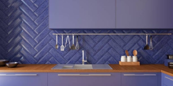
Soft Blues – coastal calmness
A pale sky blue or powder blue used on walls or island keeps the kitchen feeling fresh and open. Works beautifully with white cabinets.
Mint or Sage Green – natural, fresh energy
These soft greens add a hint of nature indoors while staying bright. Pair with white or light wood.
Blush or Dusty Pink – elegant and soft
Dusty pink is unexpected in a kitchen but when done in a very pale tone it keeps the room airy and chic. Pair with white trim and minimal clutter.
Pale Yellow – cheerful brightness
A very light buttery yellow adds sunny brightness, especially useful in kitchens with less natural light (north-facing). Tips on pairing pastels: always anchor them with neutral trim or cabinetry so the color doesn’t overwhelm. Keep finishes light and coordinate metal hardware for best effect.
Lighting Tips to Enhance Paint Brightness
Match warm/cool bulbs to your paint tone
If your paint has warm undertones, use warm light (approx 2700–3000 K) so the wall colour stays true. If the paint is cool-toned, cooler bulbs (3500–4000 K) help.
Best lighting temperature (Kelvin range) for airy effects
Aim for 3000–3500 K ambient lighting; this appears natural and keeps colours accurate without being too yellow or too blue.
Use under-cabinet or ceiling lighting to amplify brightness
Good lighting helps ensure the paint reflects well and the walls don’t fade into shadows. Under-cabinet lights or LED strips can bounce light back into the room.
When to add mirrors, glossy tiles, or metallic fixtures to reflect light
Reflective surfaces help amplify the “bright and airy” feel: glossy backsplash tile, polished hardware, or a mirror/metal accents can help bounce light, adding depth and openness.
How to Test Paint Colours in Your Kitchen (Before You Commit)
Place large paint swatches (at least a 12″×12″ area) on at least two walls and the ceiling, if possible.
Observe the swatches during morning light, midday artificial light, and evening light.
Compare the sample against your cabinetry, counters, backsplash and flooring to see undertone clashes.
View the sample from different angles and at different distances — sometimes a colour looks great up close but washes out.
Leave the sample up for at least 24 hours before deciding — your eyes adjust, and the real effect shows over time.
Common Mistakes That Make Kitchens Look Dull
Choosing paint with a low LRV (too dark) in a small or low-light kitchen — shuts down the space.
Ignoring undertones that fight existing finishes — e.g., a cool wall color clashing with warm wood floor.
Overusing stark white without warmth or texture — can feel cold or clinical if everything is flat.
Using matte finishes everywhere — matte absorbs light and can reduce the bright effect.
Forgetting ceiling and trim color contrast — if ceiling, walls and trim are the same flat color in a low-light space, the room can feel boxed in.
Complementary Accent Colors & Finishes
Trim and ceiling whites: pick a crisp white (LRV 80+) to contrast with your wall tone and keep lines sharp.
Accent wall or island: if you choose a bolder color there, keep it light-medium LRV so it stays airy (e.g., pale sage or dew blue).
Backplash, hardware and décor: metallic finishes (brass, chrome) or marble/white tile reflect light and pair well with bright wall tones. Balance is key: accent elements should support, not overpower, your main wall color.
Maintenance & Longevity Tips for Light Kitchen Paints
Choose washable, durable finishes like satin or semi-gloss for kitchen walls — these surfaces handle splashes and steam better than flat.
Use high-quality paint brands that resist yellowing or fading — especially important for very pale neutrals.
Clean light-colored walls periodically to maintain brightness — dust and grime can dull a bright paint over time.
For kitchens with strong sunlight, keep window treatments handy or UV-filtering glass to avoid paint fading or undertones shifting.
Bringing a Bright and Airy Kitchen to Life
When all the parts come together — a well-chosen paint color with a high enough LRV, correct undertone, appropriate finish, good lighting and thoughtful coordination with cabinetry, flooring and style — the result is a kitchen that feels bigger, fresher, and full of natural light. Reflective surfaces, integrated lighting and smart testing further strengthen the effect. With the right shade, your kitchen can become a bright and airy space that feels both relaxed and open.